Give Feedback While Logging In
It’s important that we give the user some feedback while we are logging them in. So they get the sense that the app is still working, as opposed to being unresponsive.
Use an isLoading Flag
 To do this we are going to add an
 isLoading flag to the state of our src/containers/Login.js. So the initial state in the constructor looks like the following.
this.state = {
  isLoading: false,
  email: "",
  password: ""
};
And we’ll update it while we are logging in. So our handleSubmit method now looks like so:
handleSubmit = async event => {
  event.preventDefault();

  this.setState({ isLoading: true });

  try {
    await Auth.signIn(this.state.email, this.state.password);
    this.props.userHasAuthenticated(true);
    this.props.history.push("/");
  } catch (e) {
    alert(e.message);
    this.setState({ isLoading: false });
  }
}
Create a Loader Button
Now to reflect the state change in our button we are going to render it differently based on the isLoading flag. But we are going to need this piece of code in a lot of different places. So it makes sense that we create a reusable component out of it.
Create a new file and add the following in src/components/LoaderButton.js.
import React from "react";
import { Button, Glyphicon } from "react-bootstrap";
import "./LoaderButton.css";

export default ({
  isLoading,
  text,
  loadingText,
  className = "",
  disabled = false,
  ...props
}) =>
  <Button
    className={`LoaderButton ${className}`}
    disabled={disabled || isLoading}
    {...props}
  >
    {isLoading && <Glyphicon glyph="refresh" className="spinning" />}
    {!isLoading ? text : loadingText}
  </Button>;
This is a really simple component that takes an isLoading flag and the text that the button displays in the two states (the default state and the loading state). The disabled prop is a result of what we have currently in our Login button. And we ensure that the button is disabled when isLoading is true. This makes it so that the user can’t click it while we are in the process of logging them in.
And let’s add a couple of styles to animate our loading icon.
Add the following to src/components/LoaderButton.css.
.LoaderButton .spinning.glyphicon {
  margin-right: 7px;
  top: 2px;
  animation: spin 1s infinite linear;
}
@keyframes spin {
  from { transform: scale(1) rotate(0deg); }
  to { transform: scale(1) rotate(360deg); }
}
This spins the refresh Glyphicon infinitely with each spin taking a second. And by adding these styles as a part of the LoaderButton we keep them self contained within the component.
Render Using the isLoading Flag
Now we can use our new component in our Login container.
In src/containers/Login.js find the <Button> component in the render method.
<Button
  block
  bsSize="large"
  disabled={!this.validateForm()}
  type="submit"
>
  Login
</Button>
And replace it with this.
<LoaderButton
  block
  bsSize="large"
  disabled={!this.validateForm()}
  type="submit"
  isLoading={this.state.isLoading}
  text="Login"
  loadingText="Logging in…"
/>
Also, import the LoaderButton in the header. And remove the reference to the Button component.
import { FormGroup, FormControl, ControlLabel } from "react-bootstrap";
import LoaderButton from "../components/LoaderButton";
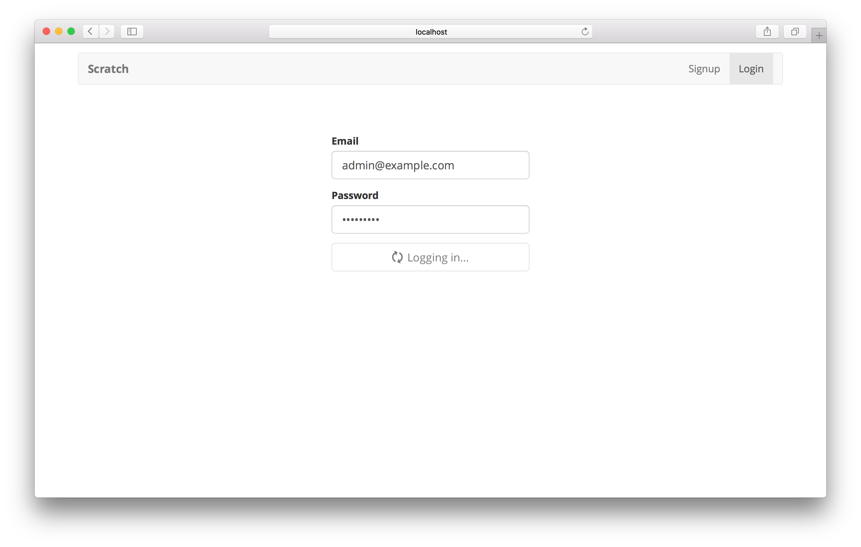
And now when we switch over to the browser and try logging in, you should see the intermediate state before the login completes.
If you would like to add Forgot Password functionality for your users, you can refer to our Extra Credit series of chapters on user management.
Next let’s implement the sign up process for our app.
For help and discussion
Comments on this chapterIf you liked this post, please subscribe to our newsletter, give us a star on GitHub, and follow us on Twitter.
Brought to you by